

Image credits: Wikipedia
RGB is a video display colour mode. It is the best mode to use for digital or online via communication. RGB stands for Red, Green & Blue which is said to be the primary colours.
CMYK :

Image credits: Wikipedia
CMYK is a printing colour mode. This mode is better to use for printing purposes. This mode is dull in result compared to RGB. CMYK stands for Cyan, Magenta, Yellow & Black which are said to be secondary colours.
COLOUR WHEEL :
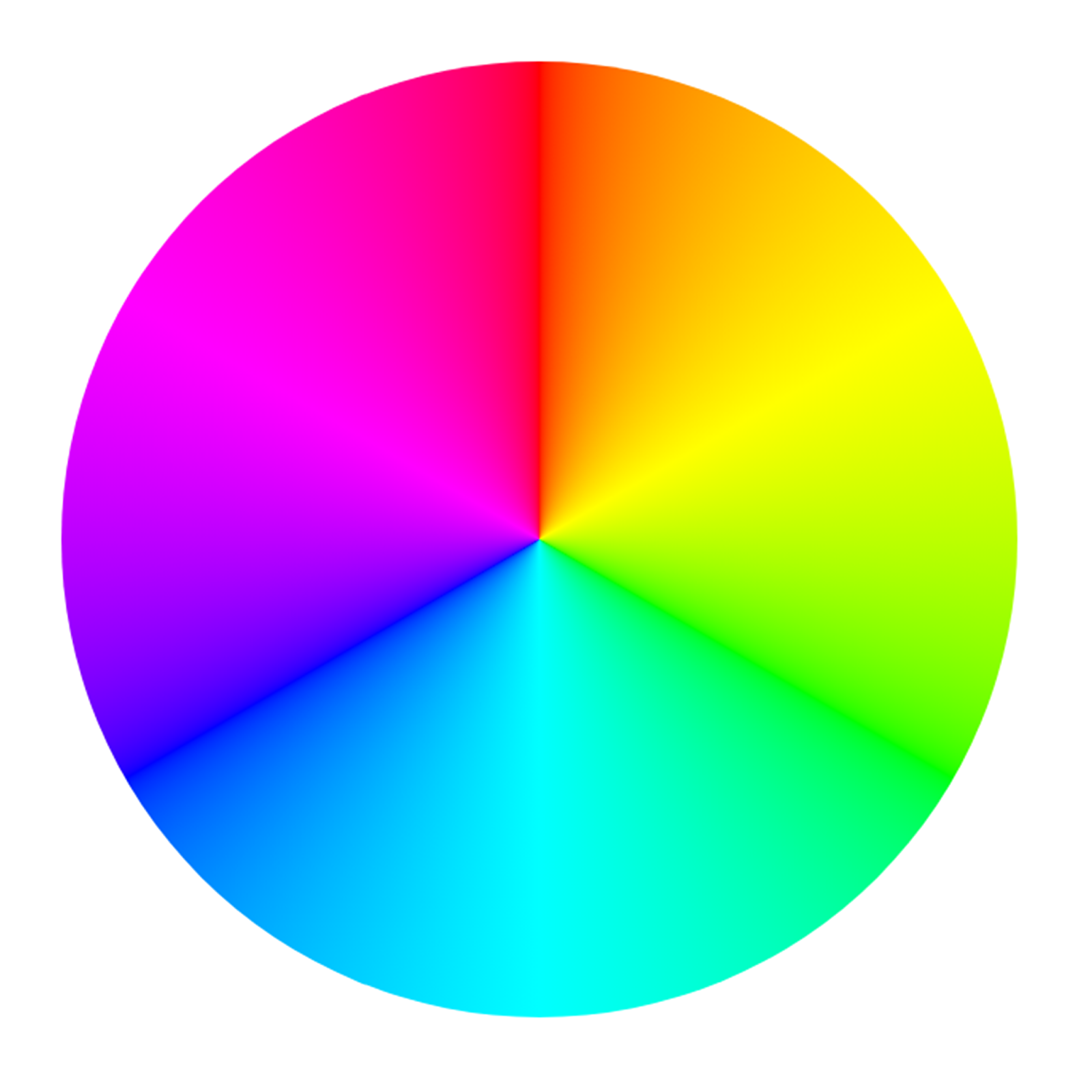
Image credits: Wikipedia
Colour wheel is an illustration which shows the relationship between the colour sector of Primary, Secondary, Tertiary.
PRIMARY COLOUR :

Created on photoshop
Primary colours cannot be created by mixing of any other colours but by mixing of these colours we can create a lot of colours. The primary colours are RED, GREEN & BLUE and it is shortly said to be RGB.
SECONDARY COLOUR :

Every Secondary colour is a mixture of two primary colours. The colours are Cyan, Magenta and Yellow.
- Green + Blue = Cyan
- Blue + Red = Magenta
- Red + Green = Yellow

Created on photoshop
Tertiary colour is a mixture of one primary and one secondary colour. The tertiary colours are,
- Red + Magenta = Rose
- Magenta + Blue = Violet
- Cyan + Blue = Azure
- Yellow + Red = Orange
- Green + Yellow = chartreuse
- Green + Cyan = Aquamarine

Image credits: Idei.club
The phrase warm colour is used to describe any colour that is vivid or bold in nature. Warm colour provides strength and fire in thoughts and can be overwhelming.Examples of warm colours include fire and volcanoes. Whereas cool colours make you feel calm, relaxed & refreshed. Cool colours give you a clear vibe.Examples of cool colours remind you of water, sky etc…
NEUTRAL COLOUR :

Image credits: Sharp school (colour theory)
Neutral colours include black, white, grey and browns. Neutral colours are most clearly defined as hues that appear to be without colour, and that don’t typically appear on the colour wheel. Neutral colours, therefore, do not compete with primary and secondary colours and instead compliment them.
COLOUR HARMONY :
The basic combination of colours chosen for creative works is called colour harmony. It suggests a relationship between colours. Colour harmony suggests us 7 basic colour schemes. They are,
Complementary
Split complementary
Analogous
Triadic
Tetradic
Monochromatic
Square

Image credits: alexandru
Choosing an opposite set of colours for your designs is called complementary colours. This colour combination is eye-catching. Even at Christmas, we use a complementary colour scheme: red and green. So we can make 6 sets of complementary colours and use those colours for our creatives.
SPLIT COMPLEMENTARY :

Image credits: alexandru
A split complementary colour scheme is based on a dominant colour and the two neighbouring colours of its complementary or opposite to the dominant colour.
ANALOGOUS :

Image credits: alexandru
Choosing three continuous colours on the colour wheel results in an Analogous colour scheme. In simply one main colour and two of its neighboring colours.
TRIADIC :

Image credits: alexandru
Triadic colour schemes are based on three equally spaced colours on the colour wheel. If you connect your chosen colours it must form a triangle shape.
TETRADIC :

Image credits: alexandru
The tetradic colour scheme, or rectangle, is based on four colours forming a rectangle on the colour wheel. It is also called the double-complementary colour scheme.
MONOCHROMATIC :

Image credits: alexandru
The monochromatic colour scheme uses variations of a single colour. You can use any base colour and make variations by adding white, black, or grey. Variation on a single colour represents highlights and shadows of the same colour.
SQUARE :

Image credits: alexandru
The square colour scheme uses four colours equally distant from each other on the colour wheel. Using these equidistant colours creates a strong contrast but can be challenging to balance.
********
Comments
Post a Comment